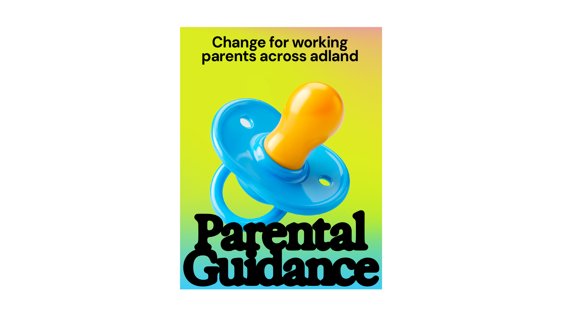
Parental Guidance Brand Identity — London
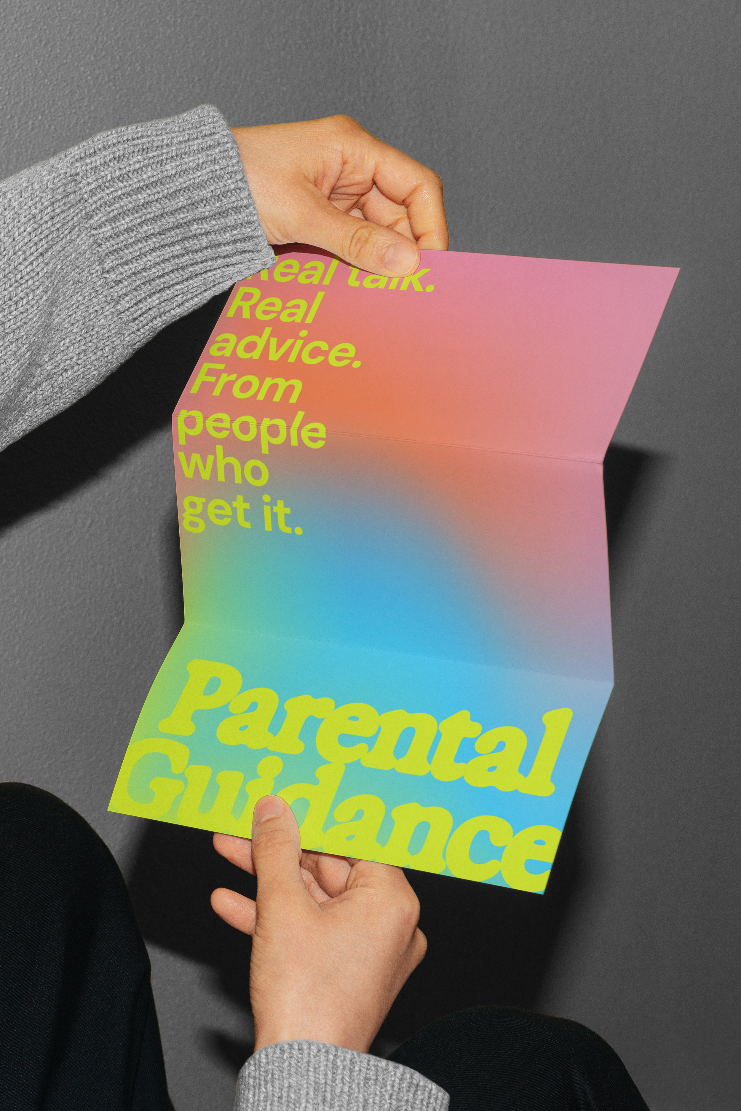
Working parents in adland don't need another polished corporate initiative. They need something that feels like them — real, in motion, a little blurred around the edges.
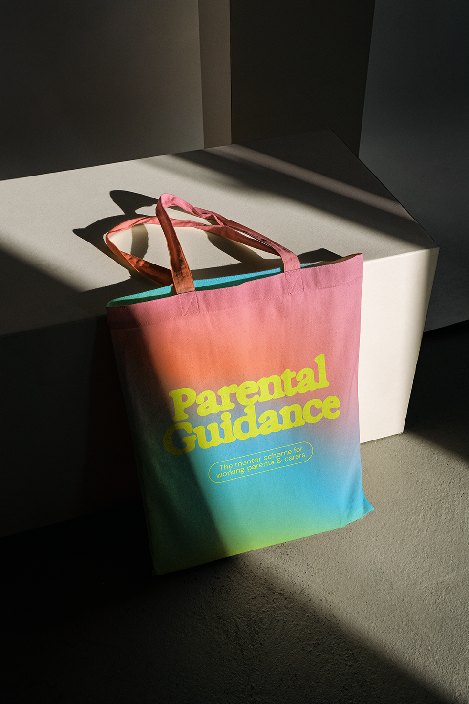
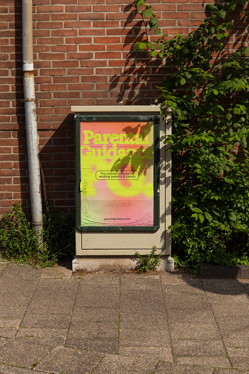
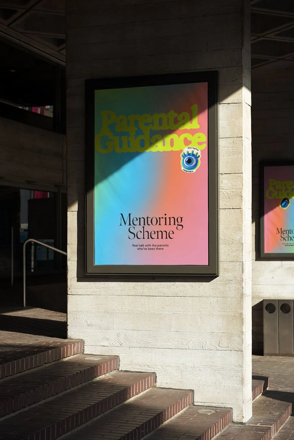
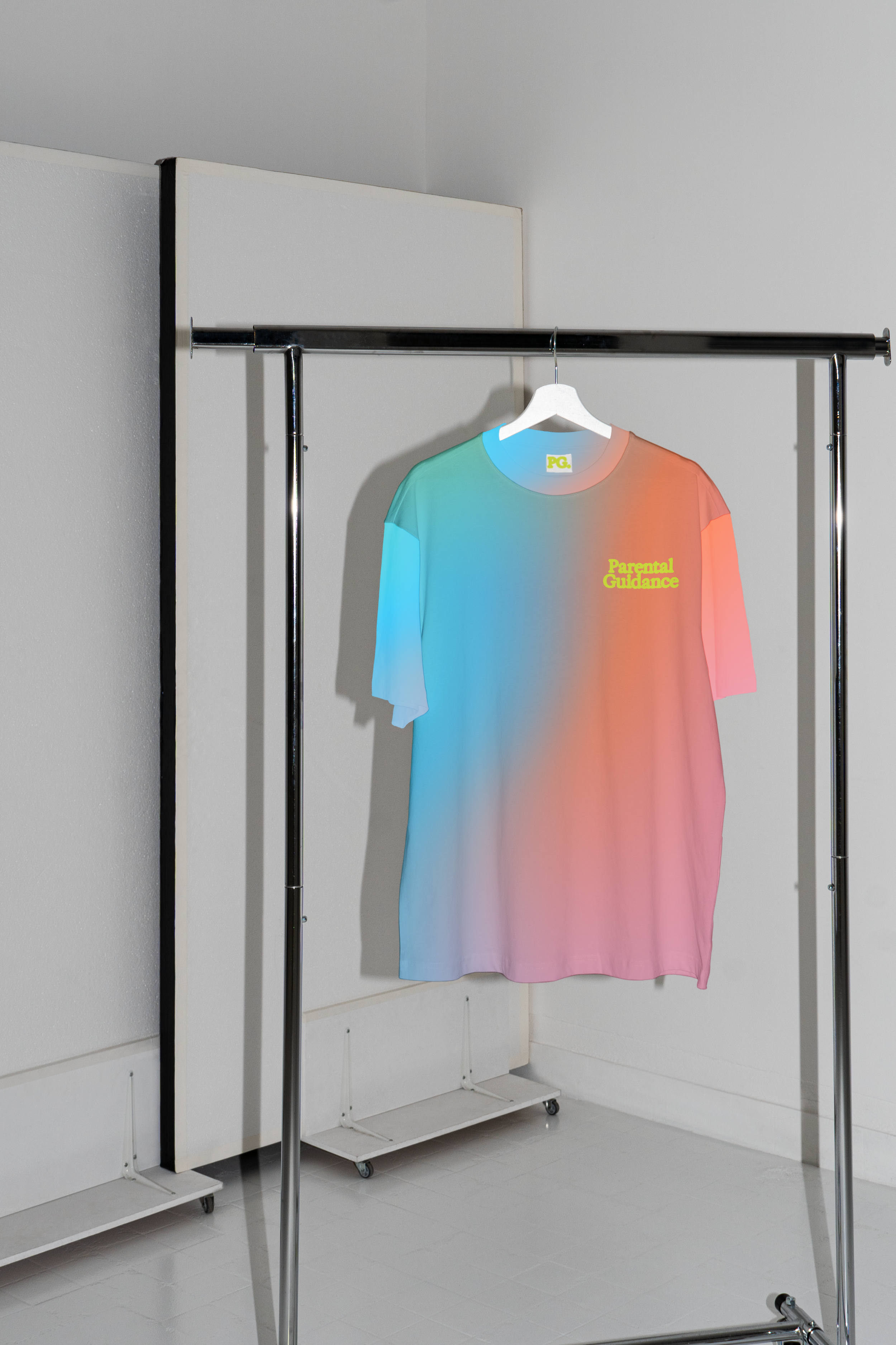
Parental Guidance is a free mentoring scheme for parents and carers in the industry, and the identity leans into the lived experience rather than the aspirational version of it. The Exposure typeface — fuzzy, soft-edged, never quite in focus — captures the beautiful chaos of balancing a career and a family. Because that blur isn't a flaw. It's the whole point.
A club worth joining.
And one that actually gets it.